Is UI design just like technical writing?

Technical writing is one of the things that I’ve spent the most time doing. Now I’m dipping my toes into UI design, and I’ve noticed some similarities.

The goal of technical writing is to communicate a concept to the reader, while requiring them to use as little brainpower as possible.
Let me give an example of bad technical writing:
Since Napoleon died in 1821, he cannot have fought in WWII.
Can you spot the issue? The problem is in that very first word, “since.”. “Since” can mean “because”, but it can also mean “from that point in time onward”. We read sentences left-to-right, so there was a point in time where you only had read this far into the sentence:
Since Napoleon died in 1821,
At that point, you had no idea what I meant by “since”. In this case I meant “because”, but for all you knew, the sentence was going to end up saying:
Since Napoleon died in 1821, the Napoleonic Code has been the foundation of French civil law.
in which case I would have meant “from that point in time onward”.
The fact that it’s ambiguous, and that the ambiguity is not resolved until later on in the sentence, forces your brain to do a little bit of extra work keeping track of the ambiguity so it can resolve it later. That work would not have been necessary if the sentence was phrased better. It should be written like so:
Because Napoleon died in 1821, he cannot have fought in WWII.
Ever since Napoleon died in 1821, the Napoleonic Code has been the foundation of French civil law.
See? Much easier to read.
Of course, this concept of brainpower-minimization extends beyond avoiding ambiguous words. Here is another trick. When someone reads what you’re writing, the very last thing they read is always at the top of their mind. So, if possible, you want to make sure that the each thing they read is related to the very last thing they read.
To accomplish this, you must be aware of “active voice” and “passive voice”. In the active voice, you start with the subject of the sentence. In the passive voice, you start with the object.
Active voice: The engineer wrote the documentation.
Passive voice: The documentation was written by the engineer.
By switching between active and passive voice, you can control what concept the reader is exposed to first. The general rule of thumb is to start each sentence with an old concept the reader is already familiar with, and finish the sentence with a new concept you’re trying to familiarize the reader with. That new concept should be invoked at the beginning of the following sentence to introduce a new concept at the end of that sentence, and so on.
Example of what not to do: The engineer wrote the documentation. Then the engineer went to lunch. An unknown party stole the documentation while he was gone.
Example of what to do: The documentation was written by the engineer, who then went out to lunch. While he was gone, the documentation was stolen by an unknown party.
I find it easier to read the second sentence. In it, each phrase conceptually links to what was directly before and after. That linking reduces how much work the reader’s brain has to do to to understand the sentence.
There’s a lot more to technical writing than just these two things. But I feel these make good examples of how you can reduce the brainpower needed to understand your writing. That is the fundamental enemy: forcing people to do unnecessary cognitive effort.
My point with this article is that UI design has the same enemy: unnecessary cognitive effort. The goal of UI design is to allow the user to use your interface, while requiring as little brainpower from them as possible.
For example, MacOS has a “Window” menu option that allows you to arrange a window such that it takes up a quarter of your screen. And it lets you pick which quarter you want.
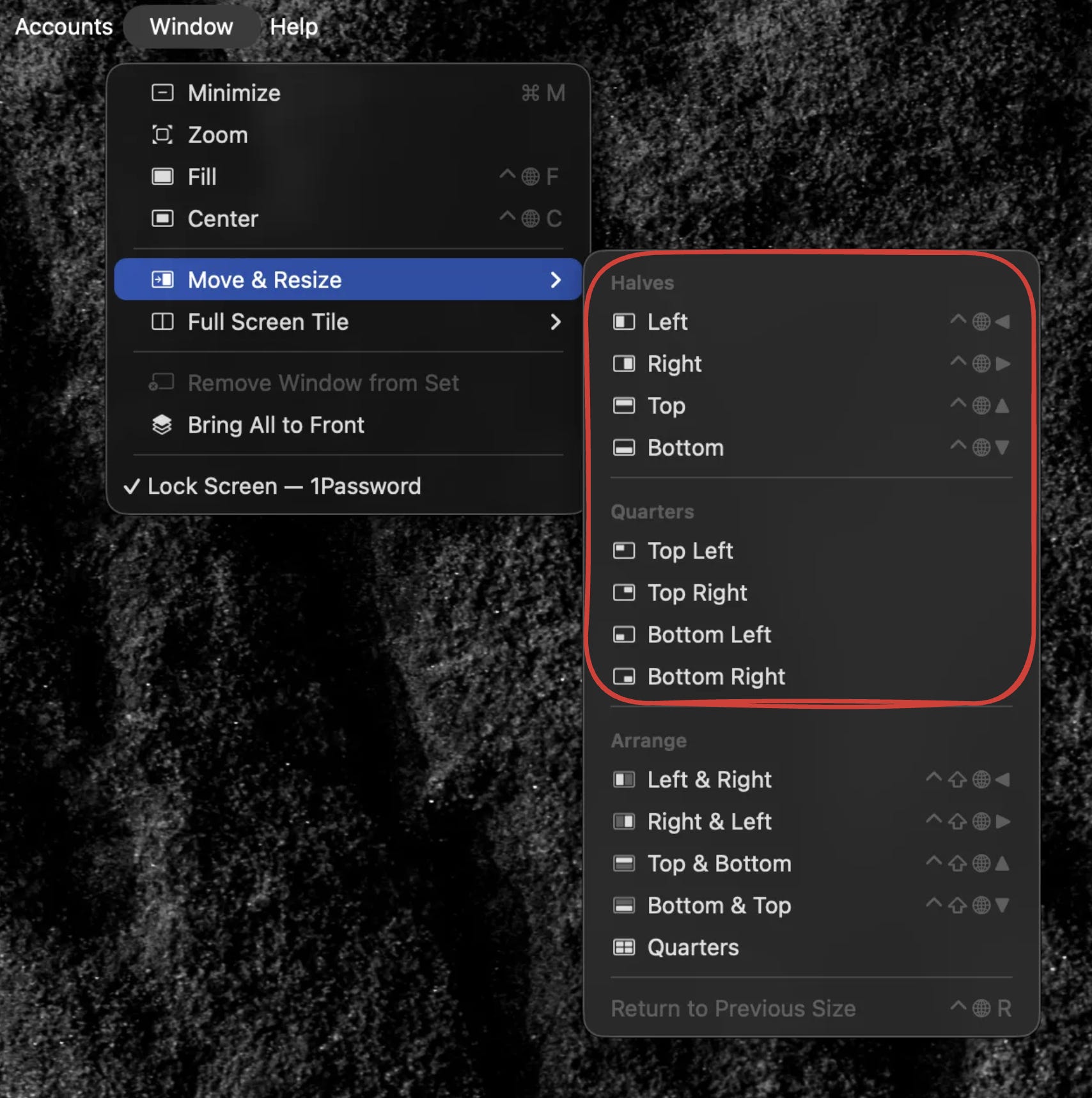
This is great. What’s great about it is that the user is probably not thinking of where they want the window in terms of “bottom left” or “bottom right”. They’re just probably looking at an area of the screen where they want they window, and they want the window to somehow just be in that area. But they most likely have not actually verbalized in their minds as “bottom left” or “top right.”
Fortunately, they don’t have to. Because in this menu, each option has an icon next to it. The icon clearly shows which quarter of the screen the window will end up in, so the user can click the icon that corresponds to their visual intuition without even having to read the text.
Here is another example - one that’s been well discussed, but only because it’s such a good example. Let’s say that someone wants to use Google to search for something, and somehow they’ve never used Google before. They end up at google.com, and see this:
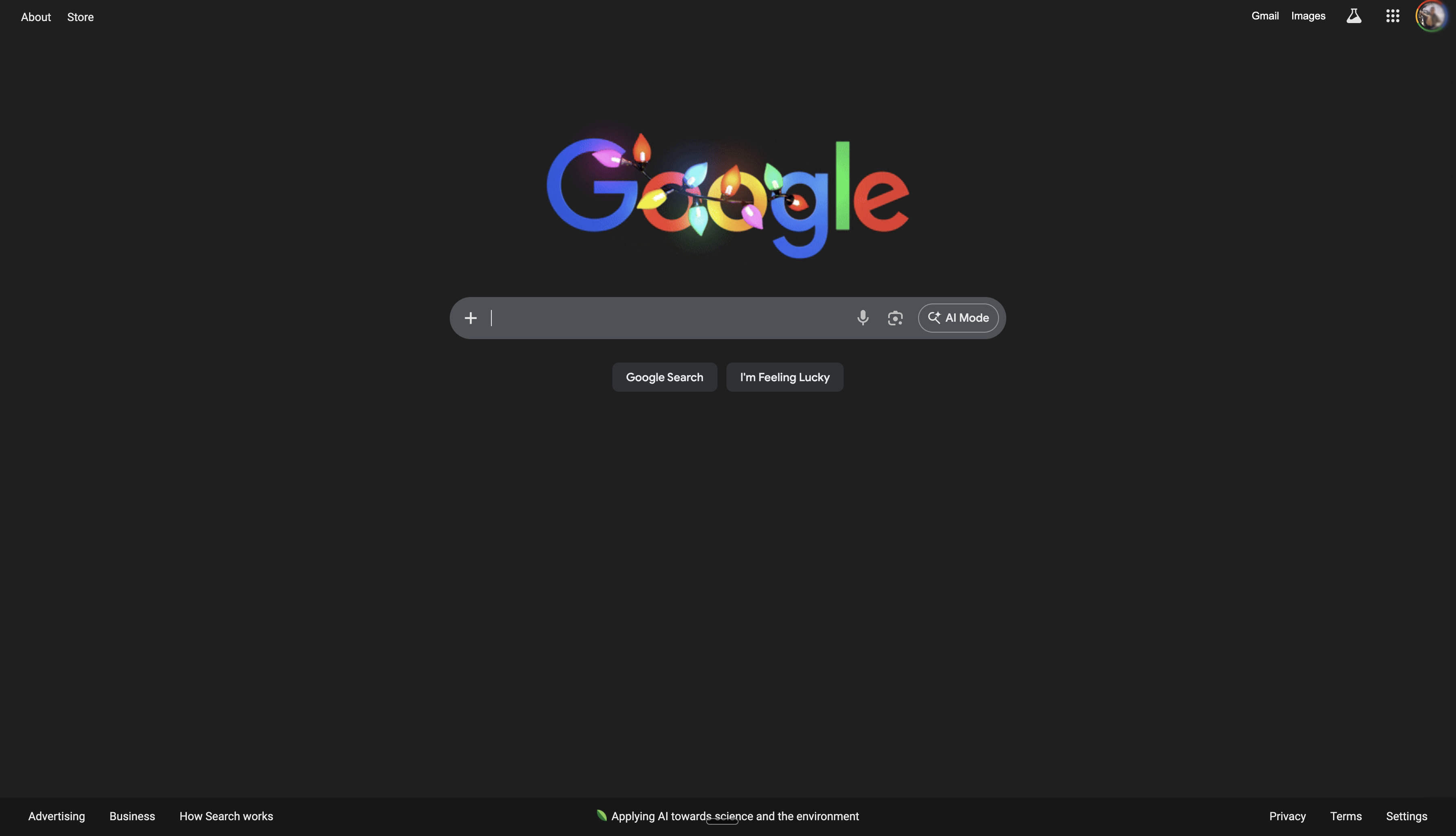
It is ridiculous to imagine that they would not know what to do next. The thing that grabs your eye the most is the word “Google”. And then below that is what is clearly a search bar. Just below is a button that reads “google search”. No one has ever needed a tutorial for how to use this site
(In my opinion, the design is made slightly worse by the “I’m Feeling Lucky” button. It was useful when Google first launched, because internet connections were slow and it avoided having to load the Google search page before going to the page you actually wanted to go to. But now, I’m pretty sure that literally nobody ever uses it, and it’s only there because it’s part of Google’s brand.)
The reason it’s so easy to use is because the very first thing you see, is what you actually need. There’s almost zero fluff or distraction
Now that we’ve seen two good examples, let’s compare them to my least favorite site, treasurydirect.gov. Treasurydirect.gov happens to be the only website that allows you to buy savings bonds, which is something I like to do sometimes. This is what their landing page looks like.
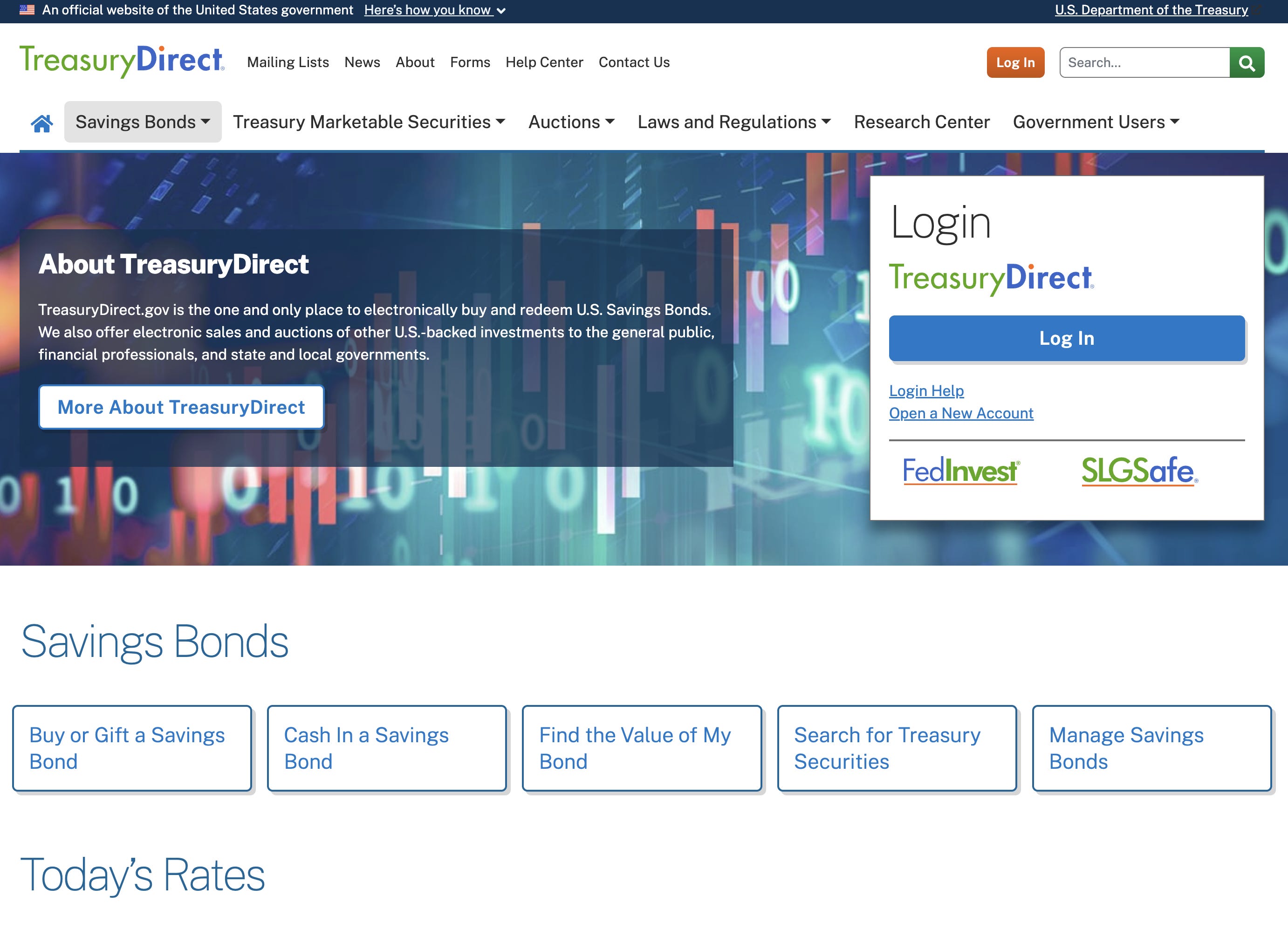
I hate to insult the designers who work for our beloved US government, but this is just terrible. I showed it to my girlfriend and asked her what the first word that came to mind was, and she said “scam”. Which, in the world of UI design, is not considered a good sign.
This site should serve two purposes:
Tell people “you can buy savings bonds here”
Let people log in or create an account (so they can buy savings bonds).
Does it succeed? I don’t think so.
I’d guess the first thing most people see is “About TreasuryDirect”. That’s fine, you have to put your branding in there somewhere. But then it leads to this insane copy:
About TreasuryDirect
TreasuryDirect.gov is the one and only place to electronically buy and redeem U.S. Savings Bonds.
The first sentence is not that bad, but I find it funny. It’s like if you went to Chase.com and it said. “Chase.com is the one and only place you can electronically access your Chase account.”
Still, nothing could prepare me for the next sentence:
We also offer electronic sales and auctions of other U.S.-backed investments to the general public, financial professionals, and state and local governments.
???????????????????????????????
I guarantee that 99% of people visiting the site are random people trying to buy I-bonds for their kids. They do not want to spend unnecessary brainpower learning about how state and local governments buy US securities through institutional auctions.
I should repeat that there is literally only one thing to do on this site. You just buy and redeem bonds. That’s literally it. It’s not complicated. But let me just go over a few more things that make it look way more complicated than it is.
This hero image:

Why are is there a candlestick graph behind floating binary numbers on a cyan background? This is sending the message “you are about to do something insanely complicated and technical, and possibly risky”. But the message should be “This is going to be safe and easy because we are trustworthy professionals.”
Now let’s say you want to sign up. You can’t miss the two (opposite-colored) “Log in” buttons, but how do you sign up? Seriously just try to figure it out.
Ok, I’ll spoil the answer. It’s a tiny link with the text “open a new account”, near the giant blue “log in” button. It’s just bizarre that the FedInvest and SLGSafe logos are so much bigger and more prominent than the sign-up button, considering they’re not relevant to literally anyone using the site.
You might not see the big deal. Most likely, you’re tech-savvy and you’ve used many weird websites. You’d figure it out if you really needed to buy some bonds, and it wouldn’t slow you down by more than a few minutes. But there are still a lot of people out there who are not like that. They would see this site and assume they were on the wrong page. If they somehow realized they were on the right page, they wouldn’t be able to sign up. And if they signed up… well, I don’t imagine that would go well either, but let’s leave that for another article.
From the perspective of the Treasury, I’m guessing that a very small percentage of their time is dedicated towards providing savings bonds to consumers. Their day is probably dominated by setting up auctions for state and local governments, and doing economic research, and whatever FedInvest and SLGSafe are. So those things were at top of mind when they went to make the site. In other words, I’m guessing they were in a completely different state of mind than their users. A state of mind so alien that they produced something unusable.
Still, it’s a designer’s job to not do that.1 They need to start with where the user is currently, and then naturally teach them what they need to know to accomplish their goals. Good design is hard, but not-terrible design is easy. Here’s my take:
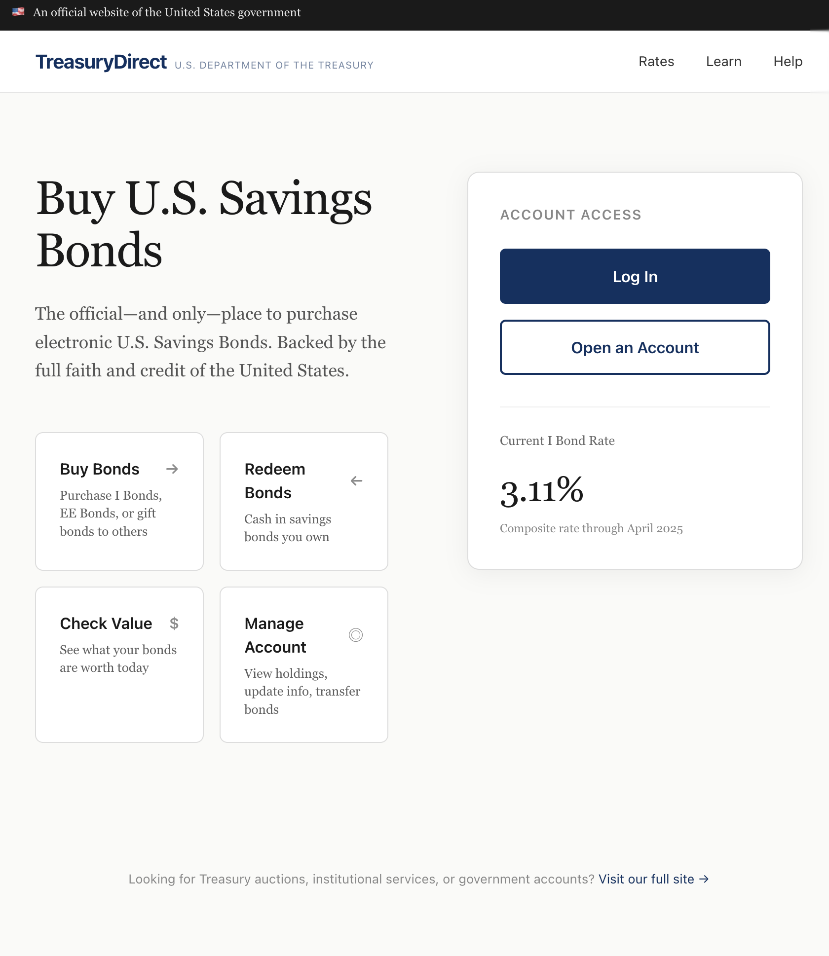
Like, this is an pretty mid design that only took me a few minutes. My point is not that it looks better than theirs, aesthetically speaking. My point is that my version requires very little cognitive effort to use. The user journey wound be “Am I in the right place? Oh look, it says ‘buy US savings bonds’, great. how do I start? oh, I probably press ‘open an account’”.
In terms of the techniques used, I don’t think there’s a big overlap between technical writing and UI design. But in terms of the goal and the mindset that’s required, I think there is a big overlap. They both are primarily about putting yourself in someone else’s shoes, who will consume your work not because they enjoy it but because they’re trying to get something else done. Every aspect of what you do has to be in service of allowing them to achieve their goal as quickly and easily as possible. And if you do it really well, people won’t even realize you did anything at all.
My guess is that no one with decision-making power at the treasury actually cares about consumer usage of the treasurydirect.gov website. I just don’t see how someone who actually cares would be happy with this.
If you like UI design because of communication clarity, you’ll love accessibility. That’s something I’ve been thinking about writing a bit about for a while now. It might look like it’s because of audio channel linearity enforcing shallow trees in option selection, but I think it’s actually about multimodality forcing a common abstraction - whatever you’re trying to convey with the hero image, you’ll have to ask yourself it it’s actually important enough and if not, then probably you want to do something else for visually unimpaired users as well. It destroys unfocused art in an extremely pleasant way.
i enjoyed reading this!